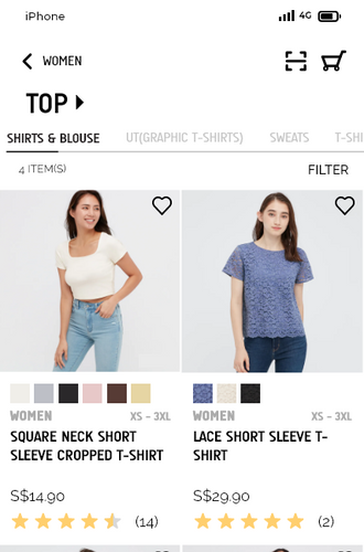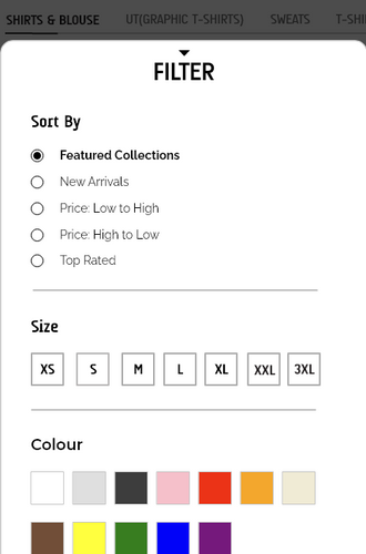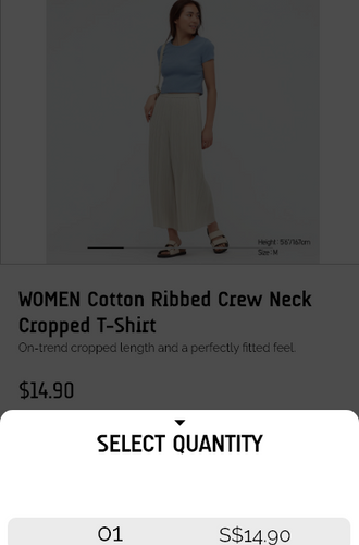
Uniqlo (Singapore) Mobile App Redesign
OVERVIEW
The Uniqlo (Singapore) mobile app brings the offline shopping experience online, allowing users to shop from the comfort of their own homes.
The goal of this project was to uncover usability issues within the existing app and to propose effective solutions to address them, and along the way suggest new features to enhance the overall user experience.
ROLE
UX/UI Designer
User Researcher
Ideation
User Persona
Task flows
Wireframing
Prototyping & Testing
November 2021 - December 2021
Background
Uniqlo is a Japanese casual apparel brand that has achieved international recognition. It's well-loved for its affordable pricing, a wide selection of versatile, easy-to-style basics, and numerous collaborations with popular character licensors and artists.
The Issue
An increase in demand for seamless and hassle-free online shopping experience potentially due to:
-
Reluctance and unease to leave home due to COVID-19 Pandemic
-
Limited time for in-person shopping because of personal commitments (e.g., work, school)
-
Extended wait times and queues when shopping in physical stores
I also observed that many users were struggling when using the app which resulted in a frustrating experience.
User Research
To gain a clearer understanding of potential issues within the app, I conducted a basic competitor analysis. I selected three popular online shopping apps which were commonly used in Singapore as the point of comparison. This analysis helped me to identify effective features and common pain points, which gave me a better insight into what users typically expect from an online shopping app.

Target Audience
To better understand the app's target audience, I conducted a simple survey and interview session to help me obtain more information.
I pinpointed three main areas to clarify during the survey and interview sessions:
-
the user's reasons for using the app
-
the frequency of use
-
features that they would like to see on the app
From this, I was able to identify what users liked and disliked about the current app.
What they liked:
-
Easy to locate sale items as they are on one page
-
The efficiency of being able to see all available items at a glance compared to being at the physical store
-
Access to membership discounts and special offers
-
The convenience
What they disliked:
-
Issues with logging in (unable to 'stay logged in')
-
Poor and messy navigation throughout the app
-
Lack of feedback when an action is taken
-
Vexing window shopping experience
User Personas
Using the insights gathered from the survey and interviews, I created five distinct user personas based on the compiled data.
User Task Flows
To gain clearer insight into areas for improvement, I developed a set of tasks and mapped out the current user task flows for each one. This allowed me to highlight specific navigational pain points within the app, and with this set of visual references, it becomes easier to assess whether the process has improved.
Registration


Homepage


Wishlist


Filtering System


Stock Check


Ideation
Sketches
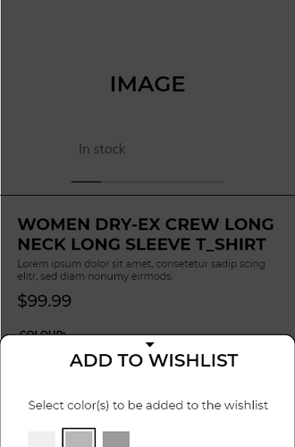
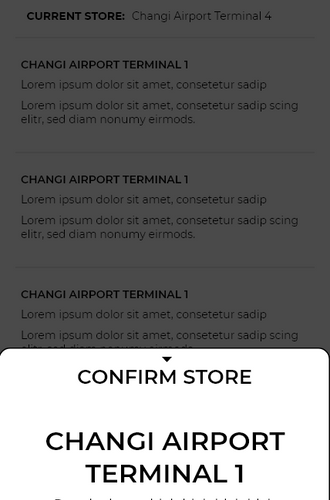
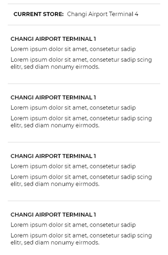
With all the research gathered, I began the ideation phase by sketching wireframes based on the defined tasks. This approach helped visualise potential solutions and allowed for quick and efficient experimentation with various layout ideas.


Low Fidelity Prototype
After completing the sketches, I combined elements I liked from each sketch to create a low-fidelity prototype. I then developed two different versions for A/B testing to determine which one was preferred by the target audience.
LoFi Prototype Version (1):

LoFi Prototype Version (2):

Final Low Fidelity Prototype
The final low-fidelity prototype merges elements from both versions (1) and (2) to create the layout that was most favoured by users.
LoFi Prototype Preview:
High Fidelity Prototype
With the final low fidelity prototype as reference, I proceeded to create the high fidelity version of the protoype.
HiFi Prototype Preview:
Usability Testing
After creating the high-fidelity prototype, I conducted another round of usability testing before implementing the final changes and adjustments. Using the feedback received, I then proceeded to design the final mockup.

Mock Up
This is the final mock up for the Uniqlo (Singapore) Mobile Application Redesign.

Final Closing Thoughts
Through the experiences gained upon completing this project, I’ve gained a deeper understanding of the challenges users face when interacting with a mobile application. Additionally, it has expanded my knowledge on improving the overall usability of an app to enhance the user experience.
I would also like to extend my gratitude to my fellow team members from Team Good Day for sharing this journey with me.
Special Thanks to:
Team Good Day
Sandy Kee
UX Designer/Researcher

Jie Yu Ong
UI/UX Designer

Nicole Tan
Product Manager


