
Google Maps Mobile App Redesign
OVERVIEW
The Google Maps mobile application allows users to conveniently navigate their way and plan their journeys without the use of traditional maps and paper.
The goal of this project was to identify any usability issues and come up with solutions that can solve the issues and even propose new features to improve the overall experience when using the application.
ROLE
UX/UI Designer
User Researcher
Ideation
User Persona
Task flows
Wireframing
Prototyping & Testing
September 2022 - October 2022
Background
Google Maps is a web-based, multilingual mapping service provided by Google, offering users detailed information about geographical areas and locations worldwide.
It provides a variety of features, including satellite imagery, aerial photos, street maps, street view (which offers a 360° interactive panoramic view of the streets), real-time traffic updates, public transportation details, and simple route planning tools.
As of 2020, Google Maps has around 1 billion active users monthly across the globe.
The Issue
As times change, people appear to be growing increasingly impatient and are constantly seeking convenience. As a result, they prioritise options that offer the most cost-effective and time-efficient routes, living by the mantra that 'time is money'.
I observed that users were encountering difficulties when using the app to search for the most efficient travel routes, leading to a frustrating experience.
User Research
To gain a clearer understanding of the issues the app presents to its users, I conducted a simple heuristic evaluation of its various aspects. This provided deeper insight into what worked and what didn’t, helping me better understand what users might potentially want from the app.

Target Audience
To better understand the app's target audience, I conducted a simple survey and interview session to help me obtain more information.
I pinpointed three main areas to clarify during the survey and interview sessions:
-
Frequency of use
-
Reasons for using
-
Features that users would like to see
From this, I was able to identify what the users wanted to keep or remove from the current app.
What they liked:
-
Route suggestions from the app
-
Able to look at the information of various places directly
-
Able to save locations to visit
-
Give contributions/reviews to help others
What they disliked:
-
App did not suggest the most optimal route
-
App chooses route that is the shortest, but often has the most traffic during peak hours
-
Unable to click on what they wanted on the app
-
Too many things appear on the map at a time
-
Unable to find a straight, clear-cut route to destination
User Personas
Using the insights gathered from the survey and interviews, I created three distinct user personas based on the compiled data.


User Task Flows
To gain clearer insight into areas of improvement, I developed a set of different tasks based on two of the three crafted personas:
-
Daniel (Primary persona, in red)
-
Emily (Secondary persona, in green)
This allowed me to gain a clearer understanding and aid me in highlighting specific pain points. With the aid of the visuals presented below, it can help me to easily identify the areas that require improvement.
Search Route to Destination with Bus/Mrt
(Primary)

Walk to Destination without using Live View
(Primary)

Walk to Destination using Live View
(Primary)

View the Reviews of a Location
(Secondary)

Add a Favourite Location
(Secondary)

Search for Similar Places (If Desired Location is Closed)
(Secondary)

Search for Similar Places Near Your Desired Location
(Secondary)

Ideation
Sketches
With all the research gathered, I began the ideation phase by sketching wireframes based on the defined tasks. This approach helped visualise potential solutions and allowed for quick and efficient experimentation with various layout ideas.


Low Fidelity Prototype
After completing the sketches, I created a low-fidelity prototype for user testing. Since it’s quick to make, the low-fidelity prototype allowed me to easily iterate on the designs as needed which helped me work efficiently.
LoFi Prototype Preview:


Medium Fidelity Prototype
After analysing the results from the first user testing session, I moved on to creating a medium-fidelity prototype and conducted another round of user testing.
MedFi Prototype Version (1) Preview:


MedFi Prototype Version (2) Preview:


High Fidelity Prototype
Ultimately, based on the feedback from the two medium-fidelity prototypes, version (1) and (2), I was able to incorporate the suggestions and additional ideas to create the high-fidelity prototype.
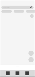
HiFi Prototype Preview:


Mock Up
This is the final mock up for the Google Maps Mobile App Redesign.

Final Closing Thoughts
Throughout this project, despite the challenges, I’m grateful we persevered and created a design that enhanced the overall user experience. I’ve gained valuable insights into designing mobile applications for a larger user base, and it’s been an enjoyable journey overall.
I would also like to express my gratitude to my fellow team members from Team One Mikaleh for sharing this experience with me.
Special Thanks to:
Team One Mikaleh
Jie Yu Ong
UI/UX Designer

Nicole Tan
Product Manager
